Your cart is currently empty!
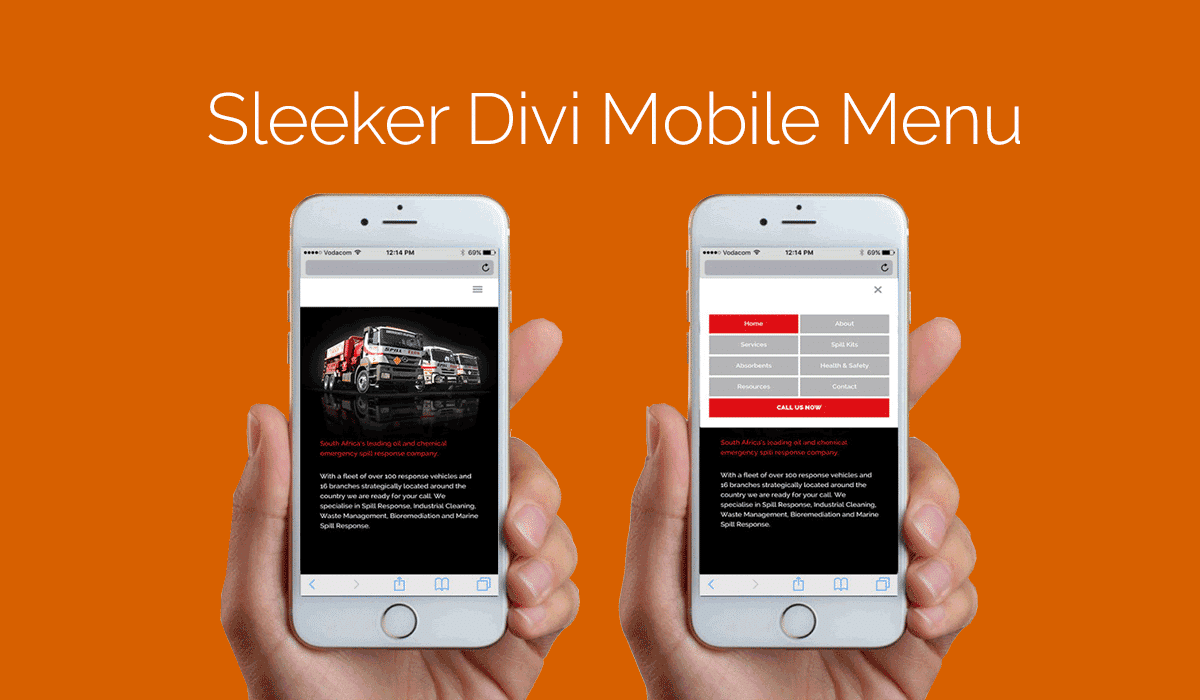
Sleeker Divi Mobile Menu
[et_pb_section admin_label=”section” transparent_background=”off” background_color=”#ffffff” allow_player_pause=”off” inner_shadow=”off” parallax=”off” parallax_method=”off” custom_padding=”0px||0px|” padding_mobile=”off” make_fullwidth=”off” use_custom_width=”off” width_unit=”on” make_equal=”off” use_custom_gutter=”off”][et_pb_row admin_label=”Row” make_fullwidth=”on” use_custom_width=”off” width_unit=”on” use_custom_gutter=”on” gutter_width=”1″ padding_mobile=”on” allow_player_pause=”off” parallax=”off” parallax_method=”off” make_equal=”off” parallax_1=”off” parallax_method_1=”off” column_padding_mobile=”on” custom_padding=”0px||0px|”][et_pb_column type=”4_4″][et_pb_image admin_label=”Image” src=”http://legacy.divistride.com/wp-content/uploads/2015/11/sleeker-divi-mobile-menu-1080×675.png” show_in_lightbox=”off” url_new_window=”off” use_overlay=”off” animation=”left” sticky=”off” align=”left” force_fullwidth=”off” always_center_on_mobile=”on” use_border_color=”off” border_color=”#ffffff” border_style=”solid”]
[/et_pb_image][/et_pb_column][/et_pb_row][et_pb_row admin_label=”row” make_fullwidth=”off” use_custom_width=”off” width_unit=”on” use_custom_gutter=”off” custom_padding=”|3%||3%” padding_mobile=”off” background_color=”#ffffff” allow_player_pause=”off” parallax=”off” parallax_method=”off” make_equal=”off” parallax_1=”off” parallax_method_1=”off” column_padding_mobile=”on”][et_pb_column type=”4_4″][et_pb_blurb admin_label=”Blurb” title=”Sleeker Divi Mobile Menu” url_new_window=”off” use_icon=”off” icon_color=”#d76000″ use_circle=”off” circle_color=”#d76000″ use_circle_border=”off” circle_border_color=”#d76000″ icon_placement=”top” animation=”top” background_layout=”light” text_orientation=”left” use_icon_font_size=”off” header_font=”|on|||” header_font_size=”25″ use_border_color=”off” border_color=”#ffffff” border_style=”solid”]
[/et_pb_blurb][et_pb_text admin_label=”Text” background_layout=”light” text_orientation=”left” use_border_color=”off” border_color=”#ffffff” border_style=”solid”]
Since Divi was released back in December of 2013 it has had incredible improvements made to the theme and it really has become the go-to theme for a lot of web designers and businesses who have focused on building their own websites using the theme.
But the mobile menu still looks pretty standard and outdated, which is why we feel that it is time to give Divi mobile menu a facelift and make it stand out a bit more instead of looking like an afterthought.
Changing the menu container width:
The Divi Mobile by default is boxed which we are not a fan of, which is why we are going to make our menu full width by adding the following code.
[/et_pb_text][et_pb_dmb_code_snippet admin_label=”Code Snippet” title=”CSS Snippet” style=”androidstudio” linenums=”on” usetabwidth=”off” use_border_color=”off” border_color=”#ffffff” border_style=”solid” custom_css_codesnippet_heading=”background:#d76000;||padding-right:3%;||padding-left:3%;||padding-top:1%;||padding-bottom:1%;||border-top-left-radius: 5px;||border-top-right-radius: 5px;||” header_font=”|on||on|” header_font_size=”18px” header_text_color=”#fcfcfc” custom_css_codesnippet_codearea=”border-bottom-right-radius:5px;||border-bottom-left-radius:5px;”]LmV0X21vYmlsZV9tZW51IHsKYm9yZGVyOjBweCAjZmZmOy8qQ2hhbmdlIHRoaXMqLwp3aWR0aDoxMjUlOwptYXJnaW4tbGVmdDogLTEyLjUlOwp9[/et_pb_dmb_code_snippet][et_pb_text admin_label=”Text” background_layout=”light” text_orientation=”left” use_border_color=”off” border_color=”#ffffff” border_style=”solid”]
Styling the menu items:
Next we want to change how the menu items display on the mobile menu, we are going to make 2 menu items sit side by side by adding the following code.
[/et_pb_text][et_pb_dmb_code_snippet admin_label=”Code Snippet” title=”CSS Snippet” style=”androidstudio” linenums=”on” usetabwidth=”off” use_border_color=”off” border_color=”#ffffff” border_style=”solid” custom_css_codesnippet_heading=”background:#d76000;||padding-right:3%;||padding-left:3%;||padding-top:1%;||padding-bottom:1%;||border-top-left-radius: 5px;||border-top-right-radius: 5px;||” header_font=”|on||on|” header_font_size=”18px” header_text_color=”#fcfcfc” custom_css_codesnippet_codearea=”border-bottom-right-radius:5px;||border-bottom-left-radius:5px;”]LmV0X21vYmlsZV9tZW51IGxpIGEsCi5ldF9tb2JpbGVfbWVudSAubWVudS1pdGVtLWhhcy1jaGlsZHJlbiA+IGEgewp3aWR0aDogNDklOwpmbG9hdDogbGVmdDsKYmFja2dyb3VuZDojYjViNWI1Oy8qQ2hhbmdlIHRoaXMqLwptYXJnaW4tYm90dG9tOjVweDsKbWFyZ2luLXJpZ2h0OjElOwpjb2xvcjojZmZmOy8qQ2hhbmdlIHRoaXMqLwp0ZXh0LWFsaWduOiBjZW50ZXI7Cn0=[/et_pb_dmb_code_snippet][et_pb_text admin_label=”Text” background_layout=”light” text_orientation=”left” use_border_color=”off” border_color=”#ffffff” border_style=”solid”]
styling the current page link:
Next we want the current page we are on to stand out from all the other mobile menu items, we are going to this by adding the following code.
[/et_pb_text][et_pb_dmb_code_snippet admin_label=”Code Snippet” title=”CSS Snippet” style=”androidstudio” linenums=”on” usetabwidth=”off” use_border_color=”off” border_color=”#ffffff” border_style=”solid” custom_css_codesnippet_heading=”background:#d76000;||padding-right:3%;||padding-left:3%;||padding-top:1%;||padding-bottom:1%;||border-top-left-radius: 5px;||border-top-right-radius: 5px;||” header_font=”|on||on|” header_font_size=”18px” header_text_color=”#fcfcfc” custom_css_codesnippet_codearea=”border-bottom-right-radius:5px;||border-bottom-left-radius:5px;”]I21vYmlsZV9tZW51IC5jdXJyZW50X3BhZ2VfaXRlbSBhIHsKYmFja2dyb3VuZDogI2RiMWMyNDsvKkNoYW5nZSB0aGlzKi8KY29sb3I6ICNmZmY7LypDaGFuZ2UgdGhpcyovCn0=[/et_pb_dmb_code_snippet][et_pb_text admin_label=”Text” background_layout=”light” text_orientation=”left” use_border_color=”off” border_color=”#ffffff” border_style=”solid”]
Call to action:
Every website should have a clear call to action that you want the user to take and since they are on their mobile device maybe your call to action should be a click to call button, you can make this link do whatever you want it to do.
to make a link that calls click on custom link option and enter this into the URL field tel:01234567810 and then enter what you would like the menu item to say in the next field.
Now let’s add the following code to our CSS
[/et_pb_text][et_pb_dmb_code_snippet admin_label=”Code Snippet” title=”CSS Snippet” style=”androidstudio” linenums=”on” usetabwidth=”off” use_border_color=”off” border_color=”#ffffff” border_style=”solid” custom_css_codesnippet_heading=”background:#d76000;||padding-right:3%;||padding-left:3%;||padding-top:1%;||padding-bottom:1%;||border-top-left-radius: 5px;||border-top-right-radius: 5px;||” header_font=”|on||on|” header_font_size=”18px” header_text_color=”#fcfcfc” custom_css_codesnippet_codearea=”border-bottom-right-radius:5px;||border-bottom-left-radius:5px;”]LmV0X21vYmlsZV9tZW51IGxpLm1lbnUtaXRlbS5tZW51LWl0ZW0tMTI0IGEgewp3aWR0aDogOTklICFpbXBvcnRhbnQ7CmJhY2tncm91bmQ6ICM4MDAwY2YhaW1wb3J0YW50Owpmb250LXdlaWdodDogYm9sZGVyOwp0ZXh0LXRyYW5zZm9ybTogdXBwZXJjYXNlOwp9[/et_pb_dmb_code_snippet][et_pb_text admin_label=”Text” background_layout=”light” text_orientation=”left” use_border_color=”off” border_color=”#ffffff” border_style=”solid”]
we are going to change the last part of the CSS Class we just added where it say’s .menu-item-124, the specific page CSS class. To do this, we need to open up our browser developer tools by right clicking and selecting inspect element.
[/et_pb_text][et_pb_image admin_label=”Image” show_in_lightbox=”on” url_new_window=”off” use_overlay=”off” animation=”left” sticky=”off” align=”left” force_fullwidth=”off” always_center_on_mobile=”on” use_border_color=”off” border_color=”#ffffff” border_style=”solid” src=”http://legacy.divistride.com/wp-content/uploads/2015/11/Screen-Shot-2015-11-30-at-7.24.17-PM.png”]
[/et_pb_image][et_pb_text admin_label=”Text” background_layout=”light” text_orientation=”left” use_border_color=”off” border_color=”#ffffff” border_style=”solid”]
once you’ve opened up your developer tools, look through the HTML until you find your last menu item and click on it, will have a CSS Class for that menu item, now replace that old CSS class with one specific to your website.
Changing opens icon:
Basically, we wanting to change the hamburger icon for an X symbol when the mobile menu is open, the X symbol let the user know to press the X symbol to close the menu.
So let’s add the following to our CSS
[/et_pb_text][et_pb_dmb_code_snippet admin_label=”Code Snippet” title=”CSS Snippet” style=”androidstudio” linenums=”on” usetabwidth=”off” use_border_color=”off” border_color=”#ffffff” border_style=”solid” custom_css_codesnippet_heading=”background:#d76000;||padding-right:3%;||padding-left:3%;||padding-top:1%;||padding-bottom:1%;||border-top-left-radius: 5px;||border-top-right-radius: 5px;||” header_font=”|on||on|” header_font_size=”18px” header_text_color=”#fcfcfc” custom_css_codesnippet_codearea=”border-bottom-right-radius:5px;||border-bottom-left-radius:5px;”]LyoqIEFwcCBTdHlsZSBoZWFkZXIgYW5kIERyb3AgRG93biBNZW51ICoqLwoubW9iaWxlX25hdi5vcGVuZWQgLm1vYmlsZV9tZW51X2JhcjpiZWZvcmUgewpjb250ZW50OiAiXDRkIjsKfQ==[/et_pb_dmb_code_snippet][et_pb_text admin_label=”Text” background_layout=”light” text_orientation=”left” use_border_color=”off” border_color=”#ffffff” border_style=”solid”]
Hopefully, your mobile menu will now fresh new look and stand out from the crowd a bit more.
[/et_pb_text][/et_pb_column][/et_pb_row][/et_pb_section]
Comments
24 responses to “Sleeker Divi Mobile Menu”
-
It works perfectly, James. Thank you SOOO much.
I stuck it in my Child Theme using the Appearance > Editor like this:///*Sleeker Mobile Menu by James Brian Fosker from Bolt Themes*///
/*Make Menu Full Width*/
.et_mobile_menu {
border:0px #fff;/*Change this*/
width:125%;
margin-left: -12.5%;
}/*Style items side by side*/
.et_mobile_menu li a,
.et_mobile_menu .menu-item-has-children > a {
width: 49%;
float: left;
background:#b5b5b5;/*Change this*/
margin-bottom:5px;
margin-right:1%;
color:#fff;/*Change this*/
text-align: center;
}/*Style Current page link*/
#mobile_menu .current_page_item a {
background: #db1c24;/*Change this*/
color: #fff;/*Change this*/
}/*Style Click to call button .must change menu-item number.*/
.et_mobile_menu li.menu-item.menu-item-463 a {
width: 99% !important;
background: #8000cf!important;
font-weight: bolder;
text-transform: uppercase;
}/*App Style header and Drop Down Menu*/
.mobile_nav.opened .mobile_menu_bar:before {
content: “\4d”;
}Good Work!
-
Glad you like it Pablo 🙂
-
-
Very cool. Now how do I only show that Call Us Now menu item to only show on mobile? I don’t want to show it on the desktop version.
-
You should have this class .et_mobile_menu at the beginning of the call to action CSS.
-
The Menu Item still shows on desktop, though.
-
Do you have a link so I can take a look because the code works correctly for me.
-
-
-
-
Hi,
Thanks for the info, and I’ve almost got this sorted apart from the hover colour, which is white, the same as the text in each button. Where do I change this, please?-
There should not be a hover colour on mobile devices, there was a bug in a version of IOS that caused a hover effect, you can see a fix for this in the resource section called code snippets.
-
-
Hi there, James
Just put this into a dev site I’m working on and it works a treat. Many thanks for the tip – looks great.
Cheers
Chris-
Hi Chris, it such a simple thing to implement and makes such a difference to the overall design of the site, glad you found it useful.
-
-
Hi James,
Thanks a lot for this – it’s a great help!
In terms of making the menu full width, I saw the following code posted on another site:
@media (max-width: 980px) {
.container.et_menu_container {
width: calc( 100% – 60px);
}
}.et_mobile_menu {
margin-left: -30px;
padding: 5%;
width: calc( 100% + 60px);
}Do you think there is any benefit in doing it this way, or does your method result in a better outcome?
Cheers,
Adam
-
Hi Adam, they both will accomplish the exact same thing, I’ve personally never used the Calc yet, I need to play with it a bit to have an honest opinion on the matter.
-
-
Hi
I really love this. Thanks. Any way to make this more responsive, I like to read tips on mobile? Comments go mad in mobile…
-
Hey Frank, what responsive issue are you having?
-
-
Hi James,
Came across your very helpful site and now I have a question I am hoping you can answer. What is the css to remove the mobile menu all together. I am feeding content to an app and do not want the menu to show on mobile.-
That quite simple here the CSS .mobile_menu_bar:before {
display: none;
}
-
-
Thanks for sharing!
Would you be able to provide help for making the fullscreen (overlay) menu displaying nicely on mobile devices as well?
When adding mail and phone number and changing the display port, mail & phone somewhat jumps around (sometimes left aligned, sometimes right aligned, sometimes right, not aligned at all but indented differently)
-
Hi James! Just read your post and it’s extremely helpful, thanks :D.
I was wondering, on my website, I’m using a transparent header with an image in the first section that also automatically becomes the header’s background image. Is there any way that the mobile menu, instead of becoming an overlay of the first section, actually can push the content from that first content down if it’s opened? For example, see our website http://www.uxpro.be
-
well. It works really well in divi 2.4.4 in divi 2.5.3 the X did not work, and in Divi 2.7 I still coud not style the mobile menu from the css style sheet. I will use 2.4 then. Thaks a lot for sharing this.It is something I needed a lot.
-
Hi Leandro, I have it working on the latest version of Divi with this code, can take a look if you provide a link
-
-
Hi James,
The Divi mobile menu comes with “Select Page” text by default across from the menu toggle. Is there a way to change the text to read “Menu” instead using CSS? Thanks for your help!
-
Hi James,
This is awesome! It works for half of the menu-items; only the sinlge menu-items. The dropdown menu-items are displayed white.. If you click on the white spane the drop-down items are showing but it looks really messy.
Any ideas how to fix this or is this only possible with single menu-items?
Thanks a lot!
-
Edit to my previous comment; I managed to style the drop-down menu items the same as the other menu-items. But when I click on them it still looks messy and not logical the order the menu items are in (next to parent and below not outlined to each other). Hopefully it makes sense what I am trying to explain, English not being my native language ;).
Thanks a lot.
-
-
I started adding the CSS but the buttons are not aligned. I think this is because I have sub-menus. What do you think?


Leave a Reply